
Website Design Tips for Better UX, SEO and Conversions
The Internet is a very competitive place. Getting people to your website is only half the battle. Once they are there, you need to keep them engaged. You also want to give them reasons to return to the site in the future and to share the site with others in their social circles. If this sounds like a tall order, that's because it is. Website management and promotion is an ongoing endeavor.

What Makes a Good Website Design?
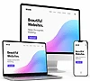
A well-designed website should be easy to understand, fast, responsive, accessible, visually consistent, secure, and focused on helping visitors complete their goals. Use clear navigation, readable typography, meaningful headings, descriptive links, optimized images, strong visual hierarchy, useful calls to action, low-friction forms, and enough white space to separate important information.
Good design is not only about appearance. It should support usability, accessibility, search visibility, trust, and conversions without adding unnecessary complexity.
Website Design Best Practices
| Design Element | Best Practice | Avoid |
|---|---|---|
| Navigation | Use clear, predictable labels and a logical hierarchy. | Vague labels and unnecessarily deep menus. |
| Typography | Use readable type, comfortable line spacing, and a limited set of font families and weights. | Tiny text, cramped lines, and excessive font changes. |
| Colors | Maintain sufficient contrast and a consistent palette. | Low-contrast text or relying on color alone to communicate meaning. |
| Images | Serve appropriately sized, responsive, compressed images. | Uploading oversized source images directly to pages. |
| Calls to Action | Use specific wording that describes the next step. | Vague buttons or making every action equally prominent. |
| Forms | Ask only for necessary information and provide clear labels and errors. | Unnecessary fields, placeholder-only labels, or unclear validation. |
| Mobile | Use responsive layouts and controls that work well on smaller screens. | Desktop-only layouts or horizontal page scrolling. |
| Links | Use descriptive link text and make links visually identifiable. | Repeated generic link text such as “click here.” |
| Layout | Create clear hierarchy, grouping, alignment, and white space. | Crowded pages with competing visual priorities. |
| Performance | Optimize media, fonts, CSS, JavaScript, caching, and delivery. | Unnecessary page weight and scripts that delay rendering or interaction. |
Website Design vs User Experience (UX)
Web design describes the visual and interface decisions that shape a page, including layout, typography, color, imagery, controls, and responsive behavior. User experience is broader: it includes how easily people understand the interface, find information, complete tasks, recover from errors, and use the website across devices and input methods.
A visually attractive site can still provide poor UX if navigation is confusing, forms are difficult to complete, text is hard to read, or pages respond slowly. Effective web design supports the complete user journey rather than treating appearance as the only goal.
Mobile-First & Responsive Web Design
Responsive design allows content and controls to adapt to different viewport sizes and device capabilities. Build layouts that remain usable on phones, tablets, laptops, and larger displays without requiring visitors to zoom or scroll the entire page horizontally.
- Use flexible layouts and responsive media rather than fixed desktop-only widths.
- Keep body text readable without requiring pinch-to-zoom.
- Make links, buttons, menus, and form controls practical to operate on touch screens.
- Prioritize important content and actions on smaller screens instead of merely shrinking the desktop layout.
- Test navigation, forms, tables, images, dialogs, and interactive components at multiple viewport sizes.
- Avoid hiding essential information from mobile visitors simply to make the layout fit.
Website Accessibility Best Practices
Accessible design helps people use a website with different devices, input methods, and assistive technologies. WCAG 2.2 provides current guidance for accessible web content. Accessibility should be considered during design, development, content creation, and testing rather than added only after a site is finished.
- Use a logical heading structure that describes the page and its sections.
- Make interactive functionality operable with a keyboard and avoid keyboard traps.
- Keep keyboard focus visible and make sure focused controls are not hidden behind sticky content.
- Provide meaningful text alternatives for informative images.
- Associate form controls with clear labels and provide useful error identification and instructions.
- Maintain sufficient text and user-interface contrast.
- Do not rely on color alone to communicate status, errors, or required actions.
- Use descriptive link text that communicates purpose in context.
- Provide captions or other appropriate alternatives for media when required.
- Use semantic HTML and native controls where they fit the required function.
- Respect reduced-motion preferences and avoid unnecessary flashing or distracting motion.
Use Visual Hierarchy to Guide Visitors
Visual hierarchy tells visitors what deserves attention first. Use meaningful headings, size, weight, spacing, contrast, alignment, grouping, imagery, and placement to establish a clear reading path. A common flow is the main heading, supporting explanation, primary action, important evidence or imagery, and then supporting detail.
Do not make every heading, button, badge, or promotional element equally prominent. When everything competes for attention, visitors have more difficulty identifying the page's purpose and next step.
Designing Overview
There is not a magic formula on designing a great web page that everyone will visit again and again, but there are things you can do that will certainly help. Some key tips to focus on are making the site as easy to use and user-friendly as possible. It should also load quickly and provide what the readers want right up front. We also listed some practical ideas for adding helpful features, clear navigation, and standout hyperlinks that make browsing a breeze. Whether you’re just starting out or looking to polish your skills, this guide offers simple steps to build a website that looks great, works well, and keeps people returning for more.
Use Conventions
A Convention is an established website design that web users have become accustomed to expect. Web conventions help create a site's cognitive schema so that they know where to find certain kinds of information or functionality. This reduces the amount of mental effort needed to understand the layout of a website. This will ultimately improve browsing efficiency. Examples are as follows:
- • The main navigation menu is placed at the top of the page, normally right side or centered
- • Logo is usually placed in the top left corner
- • Contact is included in the main navigation menu
- • Call-to-action button at the top
- • The search feature is in the header
- • Social media links (as icons) in the footer
- • Other less frequently links like Privacy Policy, Terms, etc. Are placed in the footer
Think Local But Write Global
As mentioned above, websites are global and Great Websites recognize that. You should make sure that things like currencies, measurements, dates, and times are clear so that all your readers will know exactly what you mean. You should also work to make your content Evergreen. This means that, as much as possible, content should be timeless. Avoid phrases like "last month" or the year in your text, because that immediately dates an article.
Ensure Correct Spelling
Very few people are tolerant of spelling errors, especially on a professional website. You can write for years completely error-free, and then have one simple “teh” instead of “the” and you will get irate emails from some customers, and many will give up in disgust without contacting you at all. It may seem unfair, but people judge websites by the quality of the writing, and spelling and grammar errors are an obvious indicator of quality for many people. They may feel that if you are not careful enough to spell check your site, the services you provide will also be haphazard and mistake-prone.
Listing a few online grammar and spell checkers
- • Language Tool.org
- • Reverso spell-checker
- • Writer.com
- • Grammar Check
- • Online Spellcheck
- • Ginger Software
- • Quillbot grammar-check
- • Scribens
Keep Pages Brief and to the Point
Writing for the web is different from writing for print. People skim online, especially when they first get to a page. You want the content of your page to give them what they want quickly, but provide enough detail for those who want expansion on the basics. You basically need to walk that fine line between having too much content and having too little detail.

Fast Loading Pages
If you do nothing else to improve your website, make sure they load fast. Internet connections may have gotten faster over the years, but no matter how fast the average connection is for your readers, there is always more data, more content, more images, more everything for them to download. You also need to consider mobile visitors, who may not have such wonderful connection speeds at the moment that they are visiting your page.
The thing about speed is that people only notice it when it is absent. So creating fast web pages often feels unappreciated, but if you follow all the tips you can in this article, your visitors just might stay longer.
Here are five websites that test sites for speed
- • GTmetrix - Provides detailed reports on website performance, including load times, page size, and optimization suggestions, with options to test from various global locations.
- • PageSpeed Insights - Analyzes your site’s speed and usability on both desktop and mobile, offering a score and specific recommendations powered by Google’s Lighthouse platform.
- • Pingdom Website Speed Test - Offers a simple interface to measure load time, performance grades, and a breakdown of content types, with testing available from multiple locations.
- • WebPageTest - Runs speed tests from real browsers across the globe, providing in-depth metrics like time to first byte and a waterfall view of resource loading.
- • KeyCDN Website Speed Test - A lightweight tool that delivers insights on load time, HTTP requests, and page size, with the ability to test from various international servers.
Core Web Vitals and Website Performance
Core Web Vitals are user-centered performance metrics used to evaluate important aspects of page experience. The current Core Web Vitals are Largest Contentful Paint (LCP) for loading performance, Interaction to Next Paint (INP) for responsiveness, and Cumulative Layout Shift (CLS) for visual stability.
Improve real-world performance by optimizing server response and caching, prioritizing important content, serving appropriately sized images, reducing unnecessary JavaScript and CSS, optimizing font delivery, reserving space for images and embedded content, and avoiding work that blocks user interactions. Use field data when available because laboratory tests and real-user measurements answer different performance questions.
Pages Need Clear Navigation
Navigation should be clear, predictable, and consistent so visitors can understand where they are and where important links lead. Use descriptive menu labels, organize related pages logically, indicate the current section when useful, and consider breadcrumbs or site search for deeper content-heavy websites. Test mobile menus as carefully as desktop navigation, and avoid adding menu levels that do not help visitors complete a task.
Avoid "Click Here" Links
If possible, remove the words "Click Here" from your website vocabulary. This is not the right text to use when you are linking text on a site. Annotating your links means that you should write links that explain where the reader is going to go, and what they are going to find there. By creating links that are clear and explanatory, you help your readers, and make them want to click.
While we never recommend writing “click here” for a link, you may discover that adding that type of directive right before a link can help some readers understand that the underlined, different colored text is intended to be clicked on.
A few nice examples might look like:
- • Explore More: Invites users to dive deeper into the topic.
- • Learn How: Suggests actionable knowledge awaits, fitting for a tips-based article.
- • Discover Tips: Emphasizes uncovering valuable advice.
- • Read On: Encourages continued engagement with the content.
- • Get Started: Motivates action, ideal for a guide or how-to piece.
- • Dive In: Adds a casual, enthusiastic tone to prompt exploration.
- • Find Out: Sparks curiosity about what’s behind the link.
- • See Details: Promises specific, useful information for the reader.
- • Check This Out: Casual and inviting, encouraging exploration.
- • Uncover More: Hints at revealing additional insights or secrets.
- • Take a Look: Suggests a quick, easy peek at valuable content.
- • Boost Your Skills: Appeals to readers seeking improvement, like in web design.
- • View Now: Creates a sense of immediacy and simplicity.
- • Master the Details: Implies gaining expertise, perfect for a tips article.
- • Explore the Guide: Frames the link as a helpful resource to navigate.
- • Reveal the Steps: Promises a breakdown of actionable advice.
Display Contact Info Clearly
Some people, even in this day and age, may be uncomfortable with contact information on their website. If someone cannot easily contact you. They won't.
That likely defeats the purpose of any site hoping to be used for business reasons. One important note, if you do have contact information on your site, follow up on it. Answering your contacts is the best way to create long-lasting customers, Even in today’s fast-paced digital age, we often hear about email messages that remain unanswered.

Choose Readable Website Typography
Choose typefaces for readability, brand fit, language support, and performance rather than assuming that serif or sans-serif fonts are always better for a particular role. Modern displays and browsers can render both categories effectively when the typeface, size, weight, spacing, and contrast are appropriate.
Limit unnecessary font families and weights, use a comfortable body-text size and line height, maintain sufficient contrast, and provide sensible fallback fonts. Web fonts are widely supported, but each additional font file can add page weight, so load only the styles the design actually uses and avoid delaying visible text while fonts download.
Optimize Images for Speed and Responsive Design
Resize and compress images for their actual display needs rather than uploading unnecessarily large source files. Use responsive image techniques such as srcset and sizes when appropriate, modern formats such as WebP or AVIF where they provide a practical benefit, and SVG for suitable logos, icons, and illustrations. Lazy-load below-the-fold images when appropriate, but avoid lazy-loading an important above-the-fold image when doing so would delay its display.
Set image dimensions or reserve the correct aspect-ratio space to reduce unexpected layout shifts. A CDN and effective caching can help delivery for some sites. CSS sprites can still be used in specialized cases, but they are no longer a primary general-purpose image optimization strategy for modern websites.
To reduce the size of your images, try an online image shrinker:
- • TinyJPG and TinyPNG
- • Simple Image Resizer
- • Image Resizer
- • Adobe.com
- • Pic Resize
- • Online Image Resizer
- • BeFunky.com Resize Image
Choose Appropriate Colors
Color is critical on web pages, but colors have meanings to people, and using the wrong color can have the wrong connotation if you're not careful. Web page colors by their very nature are international specific. Even if you intend your page for a specific country or locality, it will be seen by other people. And so you should be aware of what the color choices you use on your web page are saying to people around the world. When you create your web color scheme, keep in mind color symbolism.
Try the online HTML CSS Color Picker.

Differentiate Your Hyperlinks
Links should be visually distinguishable from surrounding text and should remain recognizable in hover, focus, and visited states where those states are useful. Underlines are a familiar cue, especially for links inside body copy. Do not rely on color alone when another visual distinction is needed for accessibility.
According to usability.gov, when you see underlined text, you know to click on them. The underline text draws their attention. Underlining for emphasis should be avoided, as well as the use of non-traditional colors for links.
When it comes to hyperlink differentiation. Do not need to reinvent the wheel. Sticking to already proven methods can be your best designing feature.
All Links Must Work
Broken links which leads to 404 not found, error pages are another sign for many readers (and search engines, too) that a site is not well maintained.
This includes links on your website as well as links outside your site or external links
Think about it this way, why would anyone want to stick around on a website that even the owner apparently doesn't care for? Unfortunately links or URL's change over time and is something that happens without even noticing. So it is important to use an HTML Validation Service and a Link Checker to help you check older pages for broken links. Even if links were coded properly at the launch of the site, those links may need to be updated now to ensure they are all still valid.
Select Graphics Wisely
They should be large enough to deliver good quality on a computer monitor and small enough to allow for rapid page loads. Slow websites are annoying, and huge images are the main cause of slow loading pages. It is easy to optimize your images. Use graphics that fit your content. Just because you have an adorable photo of your cat doesn't mean you should put it on your website. The exception to this is for images that are part of the design of the page and are not intended to illustrate the content. Use animated images sparingly. Flashing graphics can be distracting or annoying for most people.
Keep Layouts Basic
Keep layouts understandable and responsive. Use established layout patterns when they help visitors recognize navigation, content, and actions, but do not confuse “simple” with “identical.” Modern CSS provides flexible layout tools for creating distinctive designs without forcing page-level horizontal scrolling or sacrificing usability. Test the layout with different content lengths, viewport sizes, zoom levels, and browsers.

White Space Is Essential
It is an important and necessary design element of your layout. You should be aware of the white space on your pages and its effect on how the content is viewed. Use graphics as elements in your layouts. Graphics can be more than just graphics when you use them as actual elements in your layouts. One example occurs when you wrap text around an image, but any image you have on your site is a layout element and should be treated as such.
When Ads Are Unavoidable
When Advertising Can’t Be Avoided, Do you have control over the number of ads on your site? Be aware that your readers are not coming to read the ads. They are coming for the content. If the ads overwhelm the page content, many readers will not stick around long enough to read your text. Minimize ad placement for return viewers. Treat ads as you would any other image. Keep them small, avoid flashing ads, and keep them relevant. Just because you can have an ad on your site, doesn't mean that you should. If the content is relevant to your readers, they're more likely to click on the ad.
Remember Your Readers
Test your pages in multiple browsers. Writing web pages that work only on the most modern browser is a bad plan. Unless you are creating a website for a corporate Intranet or a kiosk where the browser version is fixed, you will have problems with people who are not able to view your pages. The same is true for operating systems. You can not assume that just because your page works in Opera, it will work in Safari. Write content the readers want. Make sure that your content covers topics that your readers want to read and that it is updated regularly. Stay on your Website topic and keep the content interesting.
Calls to Action That Help Visitors Convert
A call to action should tell visitors what happens next. Use specific labels such as “View Hosting Plans,” “Request a Quote,” “Download the Guide,” or “Contact Support” when those descriptions accurately match the destination or action. Place primary calls to action near relevant information and give them enough visual prominence to be found without making every link or button compete equally.
Reduce distractions around important decisions, keep wording consistent with the destination page, and avoid fabricated scarcity, deceptive countdowns, disguised advertisements, or other patterns that pressure visitors without providing useful information.
Form Design Best Practices
- Ask only for information needed to complete the current task.
- Provide persistent, visible labels for form controls rather than relying only on placeholder text.
- Group related fields and clearly explain required information.
- Use appropriate input types and autocomplete attributes where they improve completion.
- Provide specific validation messages that explain what needs to be corrected.
- Preserve valid entered information after an error whenever practical.
- Make forms operable with keyboards and practical on smaller touch screens.
- Provide a clear confirmation after successful submission and explain what happens next.
Website Trust & Credibility Signals
Visitors need enough information to understand who operates a site and whether an offer is credible. Useful trust signals can include HTTPS, clear business identity, accurate contact information, current pricing or terms where applicable, real policies, an informative About page, genuine reviews or testimonials when used, consistent branding, professional writing, and transparent explanations of what a visitor receives.
Trust cannot be created by badges or visual polish alone. Keep claims accurate, remove outdated promotions, correct broken links, protect visitor data, and avoid fabricated reviews, false urgency, misleading buttons, or unsupported guarantees.
Common Web Design Mistakes to Avoid
| Mistake | Why It Hurts |
|---|---|
| Cluttered navigation | Makes important information harder to locate. |
| Tiny or cramped text | Reduces readability and scanning comfort. |
| Low contrast | Can make content and controls difficult to perceive. |
| Oversized images | Adds unnecessary page weight and can delay important content. |
| Unexpected layout shifts | Can move content or controls while a visitor is reading or interacting. |
| Too many intrusive overlays | Can interrupt reading and obscure page content or keyboard focus. |
| Vague calls to action | Makes the next step harder to predict. |
| Broken links | Creates dead ends and signals poor maintenance. |
| Unlabeled form controls | Hurts usability and accessibility. |
| Desktop-only layouts | Creates poor experiences on smaller screens and touch devices. |
| Auto-playing or flashing media | Can distract visitors and create accessibility or bandwidth problems. |
How to Test Your Website Design
- Navigation: Ask someone unfamiliar with the site to locate important pages without instructions.
- Responsive layout: Test phones, tablets, desktop widths, orientation changes, zoom, and long content.
- Keyboard: Navigate interactive elements without a mouse and confirm that focus remains visible and logical.
- Forms: Test successful submissions, required fields, invalid input, error recovery, confirmation messages, and mobile keyboards.
- Links: Check internal and external destinations and repair or remove broken links.
- Accessibility: Combine automated checks with keyboard testing and manual review of headings, labels, alternatives, contrast, and interactions.
- Performance: Review Core Web Vitals, waterfalls, page weight, image delivery, caching, and third-party scripts.
- Browsers: Test the browsers and devices important to your actual audience.
- Conversion paths: Complete important tasks such as finding a plan, requesting information, making a purchase, or contacting support.
- Analytics and feedback: Use real visitor behavior, errors, search terms, support questions, and conversion data to prioritize improvements.
Website Design Checklist
- Content: Clear purpose, descriptive headings, current information, and useful answers.
- Navigation: Predictable labels, logical hierarchy, working links, and usable mobile menus.
- Responsive design: Flexible layouts, readable text, responsive media, and practical touch controls.
- Accessibility: Keyboard operation, visible focus, sufficient contrast, labels, semantic structure, and appropriate text alternatives.
- Performance: Optimized media, efficient fonts and scripts, caching, stable layouts, and monitored Core Web Vitals.
- SEO: Crawlable content, useful titles and headings, descriptive links, logical URLs, and accurate metadata.
- Trust: HTTPS, clear identity and contact information, accurate claims, policies, and current content.
- Conversions: Clear next steps, focused calls to action, and forms that ask only for necessary information.
- Testing: Browsers, devices, keyboards, forms, links, accessibility, performance, and real user tasks.
Frequently Asked Questions About Website Design
What makes a website design user-friendly?
A user-friendly website makes important information and actions easy to find and understand. Use predictable navigation, readable text, responsive layouts, descriptive headings and links, fast pages, accessible controls, and clear feedback after actions. Test common visitor tasks instead of judging usability only by appearance. The website design guide covers planning, structure, mobile design, SEO, accessibility, performance, and usability testing.
What are the most important web design best practices?
Start with clear content and navigation, then support them with responsive layouts, accessible markup, readable typography, optimized images, strong visual hierarchy, good performance, secure delivery, useful calls to action, and consistent branding. Keep pages focused on visitor goals and test them regularly. The RSH blog index includes additional web-design, SEO, security, hosting, and website-management resources.
How do I make my website mobile-friendly?
Use responsive layouts that adapt to available space, readable text without required zooming, flexible images, touch-friendly controls, and navigation that works on smaller screens. Avoid page-level horizontal scrolling and test important forms, tables, menus, and calls to action at multiple viewport sizes. The cross-browser compatibility guide explains why testing across browsers and environments remains important.
How can I make my website more accessible?
Use semantic structure, meaningful headings, keyboard-operable controls, visible focus, sufficient contrast, descriptive links, form labels, useful error messages, and appropriate text alternatives for images. Do not rely on color alone to communicate meaning. Accessibility requires both automated and manual testing. The accessible website design guide provides additional practical design guidance.
How many fonts should a website use?
There is no universal required number, but most sites benefit from a limited, consistent typography system rather than many unrelated families and weights. Choose fonts for readability, brand fit, language coverage, and performance. Load only the styles you need and provide suitable fallbacks. Modern websites are not restricted to the small list of “web-safe” fonts that older design guides commonly recommended.
What is visual hierarchy in web design?
Visual hierarchy is the use of size, weight, contrast, spacing, alignment, grouping, imagery, and placement to communicate which information deserves attention first. A strong hierarchy helps visitors scan a page and identify the main message, supporting information, and next action. It should support the content structure rather than using large or colorful elements merely for decoration.
How can web design improve conversions?
Design can reduce friction by making the offer, supporting information, and next step easier to understand. Use specific calls to action, readable content, relevant evidence, low-friction forms, predictable navigation, transparent pricing or terms where applicable, and fast responsive pages. The landing page design guide covers calls to action, forms, responsive layouts, performance, and conversion-focused design.
How can I make website images load faster?
Resize images to appropriate dimensions, compress them, choose efficient formats, serve responsive image sizes, reserve layout space, and lazy-load below-the-fold images when appropriate. Avoid delaying a critical above-the-fold image unnecessarily. Caching or a CDN can also help some sites. The image resources guide covers formats, image optimization, licensing, and visual-resource tools.
What are Core Web Vitals?
Core Web Vitals are user-centered performance metrics. The current set consists of Largest Contentful Paint (LCP), Interaction to Next Paint (INP), and Cumulative Layout Shift (CLS), representing loading performance, responsiveness, and visual stability. Use PageSpeed Insights and other performance tools alongside real-user data when available. The Site Quality Monitoring guide explains an RSH/cPanel tool for monitoring performance, SEO, security, and accessibility issues.
What are the most common web design mistakes?
Common problems include confusing navigation, low contrast, tiny text, oversized media, intrusive overlays, vague calls to action, broken links, unlabeled forms, desktop-only layouts, unexpected layout shifts, and inaccessible keyboard interactions. Fix issues according to their effect on visitors and business goals. The RSH support center provides website-design and website-management help and FAQs.
How often should I review or update my website design?
Review the site continuously rather than redesigning on a fixed calendar alone. Check important pages after content, browser, CMS, theme, plugin, analytics, or business changes, and schedule periodic reviews for broken links, accessibility, mobile layouts, performance, forms, security, and outdated information. A redesign is justified when evidence shows the current design no longer supports visitors or business goals.
Summary
Effective website design combines useful content, clear navigation, responsive layouts, accessibility, readable typography, optimized media, performance, trustworthy information, and focused conversion paths. Visual style matters, but it should support rather than compete with the visitor's goals.
Use testing and real visitor behavior to guide improvements. Review Core Web Vitals, keyboard accessibility, forms, links, mobile layouts, browser compatibility, and important conversion tasks regularly, and update the site when evidence shows that content, technology, or visitor needs have changed.
Author Bio: Mark Cole
Digital content writer with a passion for crafting engaging and informative copy. With over 9 years of international copy writing experience and...
Add Comment
This policy contains information about your privacy. By posting, you are declaring that you understand this policy:
- Your name, rating, website address, town, country, state and comment will be publicly displayed if entered.
- Aside from the data entered into these form fields, other stored data about your comment will include:
- Your IP address (not displayed)
- The time/date of your submission (displayed)
- Your email address will not be shared. It is collected for only two reasons:
- Administrative purposes, should a need to contact you arise.
- To inform you of new comments, should you subscribe to receive notifications.
- A cookie may be set on your computer. This is used to remember your inputs. It will expire by itself.
This policy is subject to change at any time and without notice.
These terms and conditions contain rules about posting comments. By submitting a comment, you agree with these rules:
- Although the administrator will attempt to moderate comments, not all comments can be moderated at all times.
- You acknowledge that all comments express the opinions of the original author and not those of the administrator.
- You will not post material which is knowingly false, obscene, hateful, threatening, harassing or invasive of privacy.
- The administrator has the right to edit, move or remove any comment for any reason and without notice.
Failure to comply with these rules may result in being banned from submitting further comments.
These terms and conditions are subject to change at any time and without notice.
Tweet Share Pin Email.
From the minds of our master copywriters
 Hosting Professionals Need Proxies for Website Speed & Security
 Web Hosting 101 ‣ The Basics for Beginners
 Choosing The Right Image Hosting Services: A Comprehensive Guide
 Essential Security Measures For Website Hosting
Offering cPanel, Free SSL (HTTPS) Certificate, Free Domain Name and Domain Private Registration
Comments